Wednesday, 18 May 2011

Jordan Bearpark A2 Evaluation

Question 1


Question 2

evaluation question 2


Question 3

What have you learnt from your audience feedback?

Whilst planning our product we were constanlty being given feedback from our peers, teachers and people ousdie of school.

When wehad to change our initial idea because of falling outs within the group, we were advised to and decided to make a really simple video that would be easy to plan, make and evaulate.

Both Mr Smith and Mr Ford made us realise that the time we had left to redo all the research and planning, make the video and evaluate the video is very limiting so they helped us make a decision as to what song to use and what to do for the shots etc.

After we made our draft, both Mr Ford and Mr Smith commented on how poor our lighting was because you could see a lot of shadowing around Livs head and because Laura was holiding the lamp you could see the light moving. Miss Sutton then showed us a video on youtube about 3-point-lighting and this then helped us improve our lighting for our final video.

For our draft we had a lot of cross cutting between different shots. We had the main video of Liv singing with no make up on and then cross cuts of Liv taking her make up off crying, not lip syncing. But Mr Smith commented that the make up was too extremeand wasn't realistic so it contradicted the message that conveyed in the video. Mr ford commented on the cross cuts and how they didn't work because it made the video lack flow. Therefore, we made the video all one continuous shot, and we toned the make up down a lot to make it seem omre realistic.

After we did this, both teachers and our peers agreed that the video worked really well and there is a clear, stron message being portrayed.


Question 4

Liv Robinson A2 Evaluation

Question 1. In what ways does your media product use, develop or challenge forms and conventions of real media products?

In order to create all three media products, I had to do a lot of research to see what was already out there on the market and learn about the music industry.

Music Video

Before we even started planning our music video we researched different genres to see which one would suit us. We looked at video after video to get some idea of what sort of style we wanted to go for and of course, the genre. After we had spent a lot of time discussing genres, we decided we liked R&B but thought we wanted something slightly different and harder to work with. We found R&B very mainstream, and that is why we then changed our minds and went for something a bit softer and chose the song 'Make You Feel My Love' by Adele, from the pop genre.

Inspirations for the Music Video

We were inspired by a fair few videos that we watched but the one we favored the most had to be Natasha Bedingfield's video 'I Bruise Easily'. In the video, we see her dressed up as a Geisha taking off her makeup and eyelashes etc. We thought this was so effective and when she cries it looks very believable and displays such powerful emotion, yet so simple. As our song choice is a song about love, and fairly sad we decided this would be a good element to include in ours, obviously with some changes. So we decided to have me, (as the singer) to begin with full makeup at the beginning and by the end of the song I had removed it all. This was hard as we did this all in one take, so if anything went wrong we had to start again.

Here is a clip from the video, and the part we were inspired by. In the video, we see Natasha looking natural with hardly any makeup on, and in our first draft we switched between me without makeup singing and then to full makeup and crying but then decided to merge it into one and have me sing the whole way through to make it more interesting.


We also looked at the Adele video but found it fairly boring compared to Natasha's. Nothing seemed to happen other than Adele looking upset in her apartment. However we did like the emotion on her face, and the way she looked down with her eyes. The mise en scene made a difference to and one aspect we liked was the lightning. There was very little light so it was dark and presented Adele to look very lonely which was what the song was trying to portray. The shots used were also ideal for the song, the long distance shots showed Adele alone and made her look isolated to everything around her and the close ups showed us the pain she was going through. Here is a clip of heightened emotion from Adele.


Overall, I think if we hadn't of looked at so many different music videos, then ours wouldn't have been as good as it is, as we needed some good ideas and inspiration to helps us.

Digipak

When I got allocated the task of creating a Digipak, at first I thought it would be fairly easy. I was yet to discover it was fairly hard. For starters, you have to make sure the Digipak has some similarities to the video and follows the same theme. As we all did individual Digipak's I wanted mine to be different to the others. I decided to follow a black and white colour scheme, as I think it looks sophisticated. Taking photos of the Digipak was hard, as we didn't want the photos too be too revealing and wanted to create a innocent looking image. We all worked together for this and experimented with different poses in order to take the pictures and then individually picked which photos we wanted to use.

Digipak Inspiration

I looked at various Digipaks, mainly ones that I liked and wanted to achieve a similar outcome. One I liked a lot, was the Katherine Jenkins digipak from her album Believe. I loved the pictures of her on the Digipak, and loved the colour scheme.


I love this close-up of her face, it makes the image very personal to the audience and attracts attention.


I like the natural pose here, and the look of her hair. I also like the font that has been used for the song titles and think it looks simple yet very professional.

Poster

For preparation for the poster I looked at different artists posters and mainly promotion posters. Most of them I looked at were not that interesting, so i wanted to make mine quite simple but make sure it attracted my audiences attention. I decided to go for a close-up image of my face and then some text below it as I didn't want the text to take over the image.

Poster Inspiration

I especially like this poster of Rihanna's as the image is very striking and attracts your attention. I like how it has sort of a blue edge to the black and white colour scheme. I also like the fonts used and the way they are displayed at the bottom of the image. We looked at several different posters to get different ideas and then created our own. I didn't want mine to look like any other poster so took different ideas from different posters.


Question 2.

Presentation1


Question 3. What have you learnt from your audience feedback?

During the media process of making our video and then creating my ancillary products i have learnt the difference feedback makes and how to use it correctly.

From the very beginning when thinking of ideas for our video, we presented our idea with a pitch and got a lot of feedback from the class when presenting. Although we got positive feedback from the class, such as they liked our idea and thought it would work, we didn't like the idea in the end and decided to change it. After facing a lot of problems due to different reasons we decided to change our second idea and after a lot of thinking we came up with a final ideal. After discussions with our teachers they agreed the new idea was the best.

During creating our video we were given tips along the way to what we could do and we had any problems we could ask our teachers or other students for some advice or possible help. When we handed in our draft, both teachers watched it and gave us some feedback. For one, our first video was too jumpy and the transitions were not smooth enough so the video looked unprofessional and of a bad quality. We were also told that it would be better if we filmed the video in one shot and didn't pause the camera at all. This would be hard, but beneficial in the long run. If we made a mistake we would have to start again, which we did have to do many times when filming, but it saved us a lot of editing and also avoided bad quality transitions. Here is an example of the transitions we weren't pleased with.


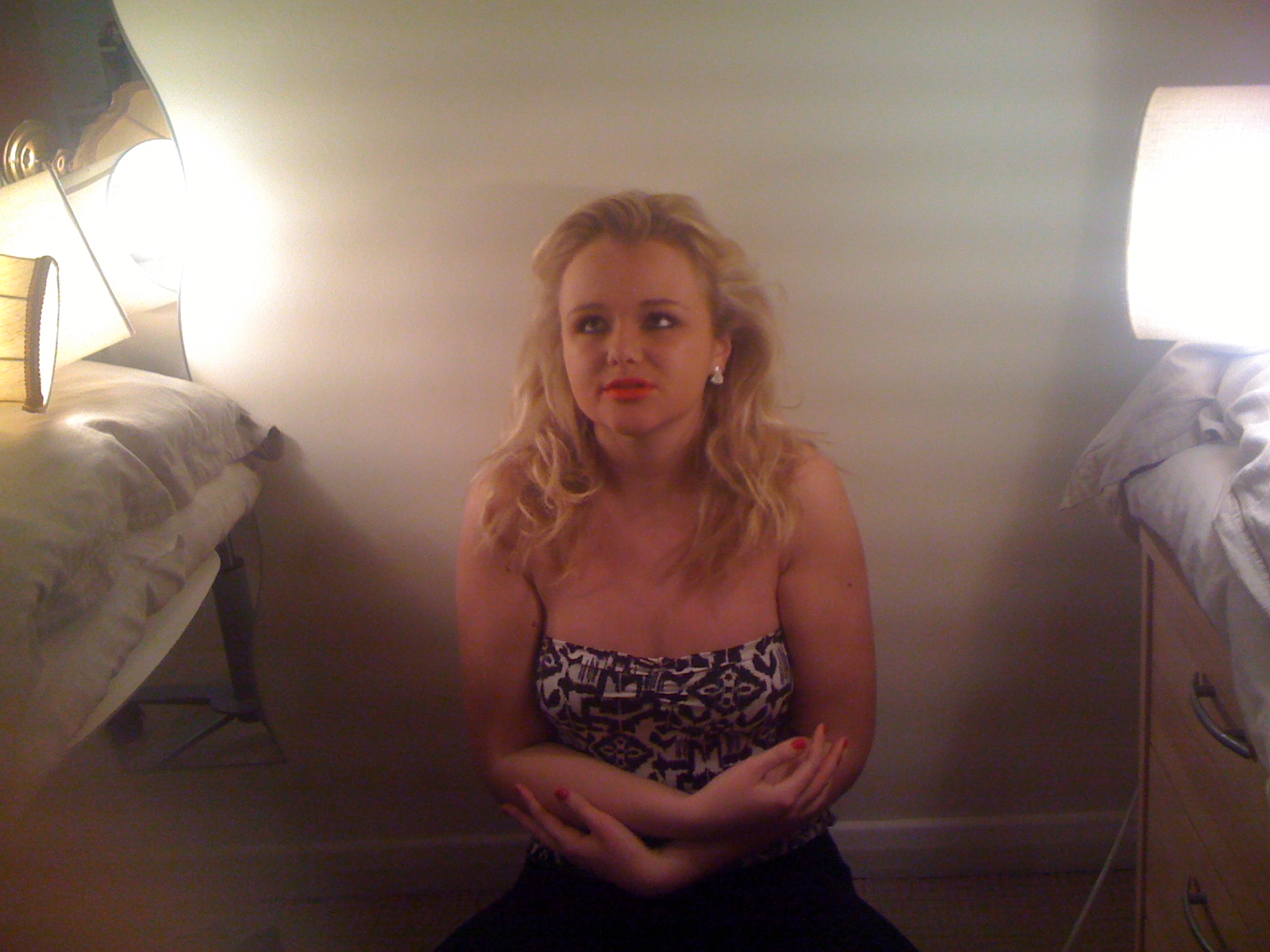
Another piece of feedback was that I had too much makeup on in the video and it was too exaggerated and didn't seem to have any true meaning to the video. As we were inspired by Natasha Bedingfields video ' I Bruise Easily' we realized that she was dressed up as a Geisha so therefore the makeup was necessary and decided to calm ours down slightly. Both teachers told us that the makeup would look a lot better if I looked more natural more like everyday makeup so the video was slightly more understandable and the artist looked better.

Draft- Too Much Makeup
Final-More Natural Makeup
When comparing the two we can clearly see how the more natural look worked a lot better and looked so much more sophisticated and not exaggerated. With the feedback we received we were able to make the video looked better so it turned out useful. To begin with, I disagreed and thought the full makeup look was creative and thought it added some interest into the video but after watching both videos several times, in the end I was pleased with the changes we had made.

After watching the video we noticed there were several shadows around me, so we came up with the idea to use three point lighting so there was no shadow. This, when perfected, which took a while, looked a lot smoother and professional when we had no shadow. This was hard to achieve, as we had to make sure the lights were very bright and all in the right position.

Ancillary Products

When I completed my first draft of my Digipak I was told to improve some of my images and change them around and also to just improve my Digipaks overall look. Here is my before and after Digipak. My cover image had to really attract my audience. Although I liked the cover image of my draft, the image wasn't in good quality so I decided to use another one.

Before


After

After looking at my before and after Digipaks, I can see why the second one is better. The quality of the images has improved and the overall layout is so much better. I think the fonts used in the second one are a lot nicer, and I like the style of the final one.

Poster

For my poster, I decided to use the same image as I used on my Digipak and from several students, I got some feedback.

' I really like the way you have used the same image as the cover on the Digipak, it shows consistency and the image is great for attracting attention'

' I think it looks good how you have used the whole page for the image instead of a smaller image, it looks very professional'

' I like the font you have used for your poster, I think it looks goes very well with the whole style'.

Conclusion

Without feedback I wouldn't have been able a piece of work that was of a good quality. With feedback I have been able to identify areas of improvement and incorporate new ideas into my work in order to make it better and improve it to the best of my ability.

Question 4. How did you use media technologies in the construction and research, planning and evaluation stages?

Prezi- I used Prezi to present my ideas at the beginning of the course and show my inspirations, and the media I have learnt and used. I used this mostly last year to show my findings and knowledge.

Animoto- Again I used this mostly last year to present work and to present one of my pitches. I found it helpful but limited on the things you can put on to it and I find the limited use of words inconvenient.

Blogger- Blogger I have found extremely helpful and always used it to blog my work and show my progress, mostly in research and planning but also to present my work.

Email- Email I have used to contact members of my group but mainly my teachers if I need to ask them for advice or for some help.

Internet- The Internet has been really helpful for all aspects of my research and planning and to look at different artists and many examples of Digipaks and posters.

Video Camera= Mainly used a video camera to film my video.

Flickr- I think Flickr is extremely useful for uploading images and displaying them in a professional looking way.

Slideshare- I have used Slideshare for presenting my pictures and have created some nice slideshows to display images I have taken for the setting of the video etc.

Scribd- I wouldn't have been able to upload most of my work to Blogger if it wouldn't have been for Scribd. Found it very useful and good to upload Word documents and also Powerpoint documents. Easy to embed into blogger.

Photoshop- I used Photoshop to edit all of my images taken for my poster and Digipak and also to create my Digipak and poster which was very easy to do using Photoshop. It's a great photo editor and I feel comfortable with the software.

Digital still camera- I used a camera for taking all the images for the Digipak and Poster, but also to show examples of us preparing to film the music videos with all of the props and some images of us actually filming.

Blackberry- I also used my phone to contact members of my group and to organize dates for filming and taking pictures for our ancillary products etc.

Facebook- Facebook has been very useful for contacting members of the group but also been easy to chat to them on Facebook to organize things and sometimes to send pictures over Facebook email to put on the blog.

Thursday, 27 January 2011

Laura Danson A2 Evaluation

Question one

In what ways does your media product use, develop or challenge forms and conventions of real media products?

http://prezi.com/pyul7-9xhiiu/laura-danson-a2-media-evaluation/

Question Two

How effective is the combination of your main product and ancillary texts?

http://www.scribd.com/full/47718794?access_key=key-2fbyxxm4n6abf4cv7ogg

Question three

What have you learned from your audience feedback?

From our blog, class feedback and questionnaires we were able to find out opinions and suggestions from others to help us improve our work. We tended to have positive feedback and were told that the idea was good and worked well. We were also told the song choice and the idea for the video worked well together as they were both simple and emotional. Our first piece of negative feedback we recieved was a comment on the shadowing behind Livs head. We knew this was effecting the quality of our video as it made it look less professional. To resolve this we had to attempt to do three point lighting. To do this we researched on the internet the most effective way to do this, and we found the video below. We used three lights, one at either side and one from the front. This improved the shadowing when we filmed our final video.


Another comment that was made from our feedback was that on our draft Liv was wearing too much makeup and it didnt look realistic. We were told it didn't make sense as to why she was wearing so much.


After hearing this feedback we took it on board and toned Livs makeup down. She wore minimal foundation, red lipstick and some mascara. This looked a lot more natural.

Feedback also told us that Liv wasn't putting enough emotion into the video. So in order to make the video have more of an emotional impact, we practiced lots of times so Liv could feel comfortable and put more emotion into her facial features and voice. This proved to be more effective as it made the video and performance a lot more realistic.

At the beginning of our draft it opened on Liv and we were told it didn't look very good. So instead we decided to open it with a black background with Livs information on, Song title etc. This made the video look a lot better as it introduced the song and artist, and then drifted into the video.

Question Four

How did you use media technologies in the construction and research, planning and evaluation stages?


Monday, 20 December 2010

Plan for question 4; How did you use media technologies in the construction and research, planning and evaluation stages?

Again, i will use prezi and talk about how i used each peice of technology along with logos.

The peices of technology i used were;
● Google
● Blogger
● Slideshare
● Prezi
● Scribd
● Animoto
● Mac
● PC
● Video Camera & still camera
● Hard-drive
● Tape
● Microsoft word
● YouTube
● Photoshop
● ipod
● ipod docking station
● iphone
● Internet
● e-mail

There could be more peices of technology that will come come to me when I do the full evaluation.

Plan for question 3; What have you learned from your audience feedback?

We have had several forms of feedback. the majority of this has come from the blog where Mr Smith and Mr Ford have commented on our music video, research and planning and ancillary products.

I will put several pictures, like the one to the left, onto a photoshop document and talk about how, as a group, we used the feedback that was given to us to improve our products.

Wednesday, 15 December 2010

Plan for question 2; How Effective is the Combination of Your Main Product and Ancillary Texts?

I will use microsoft word, like I have analysing previous digipaks, then upload them to scribd for the digipak and poster, use prezi and put tube chopped clips on that for the music video.

All three of our products fitted together because we followed the theme of iconography where Liv as the main focus on all the products. We ranged through shots throughout our products i.e. head shot, mid shot, close up, long shot. But each shot was always shot from the front never at an angle i.e. low/high

In all products I tried to keep the colours simple and stuck to black, white and grey. And the on the front cover I had the really red lips and copied the lips onto the back page aswell. The music video also has simple colours; white back ground, Liv's plain skin etc.


I will analyse each part of all my ancillary products; digipak, poster and the music video.

Plan for question one; In what ways does your media product use, develop or challenge forms and conventions of real media products?

Prezi, tube chop

Videos that inspired us:
• Natasha Bedingfield – I bruise easily, looking in the mirror taking making up off whilst crying
• Sinead O’Connor – Nothing compares to you, one take of her singing into the camera emotionally
• Janelle Monae, one take of her singing into the camera emotionally
• The Verve - Bittersweet Symphony, singing into the camera

Digipak’s that inspired us:
• Britney Spears- In The Zone, close of Britney’s face
• Natasha Bedingfield, close up of her face filling the frame, brightened so you can only see the mouth, eyes etc.

Symbolism:
• First draft- the two scenes (make up on and make up off) represent how she has stripped herself bare and has revealed her true self for the one she loves
• Final draft- like the first draft, she takes her make-up off but all on one take, symbolising that she is stripping herself bare and revealing her true self

Theory:
• Barthes- enigma- the enigma and action codes in our video could be when Liv cries and smudges her make-up it’s clear she is going to take it off all together etc.
• Todorov- equilibrium- Liv has make-up on was the equilibrium, Liv crying and taking her make-up off was the disequilibrium and Liv without any make-up on was the new equilibrium.
• Levi-Strauss- binary oppositions- there isn’t really a binary opposite in our video because it’s only one simple take. But purity and corruption could be opposites, because Liv is seen as corrupted when she has make-up on then she is pure without any make-up on
• Prop- narrative roles- Liv fits into different roles like… the hero and the princess
• Goodwin:
- illustrate- Liv was crying so this illustrated the meaning of the lyrics
-amplify- the meaning of the song I amplified through Liv’s facial expressions and actions
-relationship between lyrics and visual- Liv mimes the whole song and when she says certain words she does certain actions i.e. when the song says ‘dry your tears’ Liv wipes a tear from her face
-close ups on main artists- There is a close up of Liv on the video, digipak and poster
-intertextual references- similar to Sinead O’Connor, Janelle Monae etc

Monday, 13 December 2010

My Digipak and Poster


This is my digipak. I'ts very rushed because I'm not familiar with photoshop and stuggled a bit but I did the best i could.


This is my poster, again it is very rushed because I struggled with photoshop.

Thursday, 2 December 2010

Digipak Draft


Here is my draft for my Digipak. I have not included every element that will be on the Digipak(such as the text) but have included the type of images I will be using to show the style I am going for the type of fonts I like. The quality of two of the images, one being the image of me from behind and the image of my face, are not of a good quality. When it comes to the final, I will take time to edit properly so the images look professional.

I like the colour scheme of black, grey and white as I think it looks simple yet sophisticated. I decided to edit an image so it was just my eyes, mouth and nose that were visible as I thought this stood out and looked creative. I also am happy with the idea of writing across my back on the other image as I thought it looked fairly unusual and eye catching.

From doing a draft its easy to identify what I will change when it comes to the final Digipak and gives me some inspiration and ideas to think about for my final piece of work and how to improve it.


Wednesday, 1 December 2010

Change Of Name - Again!

We decided that we didn't like the name Ashleigh anymore because it was too long and took up too much of the digipak, poster etc.

Liv said we could use something like 'Coral' as a joke but we then decided we actually liked it and we've kept the idea and used the name 'Coral' on our digipak etc.

But as i was writing this post i realised our video says the name 'Ashleigh' on our video and thats been handed in and can't be changed so we're going to have to keep the name 'Ashleigh'.

Tuesday, 30 November 2010

Mock ups

Today we took some more photo's of Liv as we felt the last photo's we took were to seductive and didn't give the right impression of Liv. So after taking some more here are a couple of mock up ideas i did.


Monday, 29 November 2010

Britney Spears - In The Zone

Media Album Analysis

Analysis of Katherine Jenkins- Believe

I have analysed this album cover and back to gather inspiration from the album. I love the colour scheme and I think we are going to use black white and grey as our colour scheme too. It looks very sophisticated and simple. I think black white and grey is a very modern colour scheme to use and always looks effective when used. i also like the nature of the images used for this, they are not too revealing and carry Ferguson's theory of the ' Chocolate Box' theory. She still looks very attractive in the images without looking over the top and inappropriate.

katherineee
Conventions
In the covers shown above, Natashas hair and make-up is very natural. I like this look as it looks simplistic and natural. I think this look would work well for 'Ashleigh' as her music is very soft, There's no tempo, electro beat etc there's just acoustic guitars and pianos. I also like the front cover because it looks different and is very creative. it is similar to the one i designed, and i think we could achieve this style of cover. I also like the way the front cover is very plain and then the back is more colourful and packed. Its different to usual digipaks as it lacks continuity.

Wednesday, 24 November 2010

digi pak cover.


Today me and Liv took plenty of photo's that we could then use for the digipak and poster. After looking through them i picked this one as i thought their are three elements i could pick out to add colour too. I also thought it was a good photo of Liv, and followed the 'naked' theme from our video. This is a first draft i have done for our digi pak cover! i liked this idea because it looks simplistic because of the black and white, plain close up shot, however adding hints of colour in has made the cover become more appealing. Our album name is Ashleigh as its her 'first album'. Therefore we dont need to add her album name on the cover as it is covered by her own artist name.

Make You Feel My Love - Draft


This is the video of our draft music video.

The feedback we got on this is on previous posts.

When watching back I have noticed how choppy it is and that it doesn't look very good or professional. Which is why we decided to do our final as one big clip.

Wednesday 24th November

Today our group split up to do separate bits, i finished editing the music video, burnt it onto a DVD, handed it in and uploaded both the draft and final video on YouTube to then put on our blog. Whilst i was doing this, Laura and Liv went back to Liv's to take pictures for the digipack and poster, we felt this was the best option as the final deadline is Friday.

I am currently waiting for YouTube to finish processing both the videos so i can upload them to the blog and analyse.

Sunday, 21 November 2010

Final filming pictures


Here are some photo's from our final filming! Firstly weve got the set up of the room. We decided to use more lamps in order to create a brighter light and also try and reduce the shadowing behind Liv. I then took photos whilst filming in order to show our work in another way than just our video. Neither me or Jordan held the camera when filming, we used the tripod in order to keep the filming level.

Wednesday, 17 November 2010

Filming- Final Draft

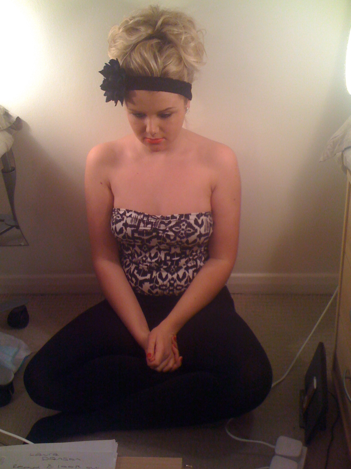
Today we decided to film our final piece for media. Obviously we knew we had to make changes to the video. We decided we would have fairly natural makeup with red lipstick and hair scraped back into a bun with a headband and flower. This time we preferred the new look without so much makeup as it looked realistic and sophisticated. After finishing the makeup and hair we decided we would add earrings and we decided not to wear a necklace. In our draft I wore no nail polish but this time I decided it would look better if I wore a bright red polish to co-ordinate with my lipstick.

Once we were happy with the look, we started to practice the song as we filmed it all in one take so one small mistake would mean having to start from the beginning which could make it a fairly lengthy procedure. One of the difficulties was that we couldn't get the lighting right for a while as the three point lighting didn't work at first but after a bit of time and effort we managed to achieve this. This was important as we didn't want any shadows to be apparent. We had to practice a few times as we slightly changed the routine and did things in a different way. We also decided that I would amplify certain words and use actions to do so. We thought it would look better if we removed most of the makeup in the duration of the video so I had a mirror in front of me so I could see what areas of makeup needed taking off.

After the practices we then went for the real thing, in which a few times we had to stop and re-film as different things kept stopping me from carrying on. For example when untying my bobble my hair got stuck and we had to film again, and on another occasion my necklace would not unfasten so we decided to not use as we didn't like it that much in the end.
After filming the whole sequence a few times we were eventually satisfied with the finished product.

In conclusion I think it is good how you have a draft and then a final piece as there is always things you can improve and make your video look more professional and of a better quality. feedback certainly helped as we were able to clearly notice what needed to be changed and some points of where improvement was needed.

Monday, 15 November 2010

Feedback; Option 3

We have got feedback and grades from our teachers, and they have suggested 3 options we should think about.

The 3rd option we have been given is to keep our video pretty much the same but the idea is to have a lot less make-up and to have singing throughout the whole video. We were told that the narrative wasn't clear as to why the shots quickley cut from Liv having no make-up on, singing, to having heavy make-up on and not singing.

Audience feedback suggested that Liv sings throughout the whole video, both with make-up on and no make-up on because this would make the video have more narrative and fit together better, which then makes the transactions smoother.

We have chosen to do trial runs of all of the options and then pick the one that looks most effective, although our favourite idea is option number 1 because we feel it will look the most effective.