Again, i will use prezi and talk about how i used each peice of technology along with logos.
The peices of technology i used were;
● Google
● Blogger
● Slideshare
● Prezi
● Scribd
● Animoto
● Mac
● PC
● Video Camera & still camera
● Hard-drive
● Tape
● Microsoft word
● YouTube
● Photoshop
● ipod
● ipod docking station
● iphone
● Internet
● e-mail
There could be more peices of technology that will come come to me when I do the full evaluation.
Monday 20 December 2010
Plan for question 3; What have you learned from your audience feedback?
 We have had several forms of feedback. the majority of this has come from the blog where Mr Smith and Mr Ford have commented on our music video, research and planning and ancillary products.
I will put several pictures, like the one to the left, onto a photoshop document and talk about how, as a group, we used the feedback that was given to us to improve our products.
Wednesday 15 December 2010
Plan for question 2; How Effective is the Combination of Your Main Product and Ancillary Texts?
 I will use microsoft word, like I have analysing previous digipaks, then upload them to scribd for the digipak and poster, use prezi and put tube chopped clips on that for the music video.
All three of our products fitted together because we followed the theme of iconography where Liv as the main focus on all the products. We ranged through shots throughout our products i.e. head shot, mid shot, close up, long shot. But each shot was always shot from the front never at an angle i.e. low/high
In all products I tried to keep the colours simple and stuck to black, white and grey. And the on the front cover I had the really red lips and copied the lips onto the back page aswell. The music video also has simple colours; white back ground, Liv's plain skin etc.
I will analyse each part of all my ancillary products; digipak, poster and the music video.
Plan for question one; In what ways does your media product use, develop or challenge forms and conventions of real media products?
Prezi, tube chop
Videos that inspired us:
• Natasha Bedingfield – I bruise easily, looking in the mirror taking making up off whilst crying
• Sinead O’Connor – Nothing compares to you, one take of her singing into the camera emotionally
• Janelle Monae, one take of her singing into the camera emotionally
• The Verve - Bittersweet Symphony, singing into the camera
Digipak’s that inspired us:
• Britney Spears- In The Zone, close of Britney’s face
• Natasha Bedingfield, close up of her face filling the frame, brightened so you can only see the mouth, eyes etc.
Symbolism:
• First draft- the two scenes (make up on and make up off) represent how she has stripped herself bare and has revealed her true self for the one she loves
• Final draft- like the first draft, she takes her make-up off but all on one take, symbolising that she is stripping herself bare and revealing her true self
Theory:
• Barthes- enigma- the enigma and action codes in our video could be when Liv cries and smudges her make-up it’s clear she is going to take it off all together etc.
• Todorov- equilibrium- Liv has make-up on was the equilibrium, Liv crying and taking her make-up off was the disequilibrium and Liv without any make-up on was the new equilibrium.
• Levi-Strauss- binary oppositions- there isn’t really a binary opposite in our video because it’s only one simple take. But purity and corruption could be opposites, because Liv is seen as corrupted when she has make-up on then she is pure without any make-up on
• Prop- narrative roles- Liv fits into different roles like… the hero and the princess
• Goodwin:
- illustrate- Liv was crying so this illustrated the meaning of the lyrics
-amplify- the meaning of the song I amplified through Liv’s facial expressions and actions
-relationship between lyrics and visual- Liv mimes the whole song and when she says certain words she does certain actions i.e. when the song says ‘dry your tears’ Liv wipes a tear from her face
-close ups on main artists- There is a close up of Liv on the video, digipak and poster
-intertextual references- similar to Sinead O’Connor, Janelle Monae etc
Monday 13 December 2010
My Digipak and Poster

This is my digipak. I'ts very rushed because I'm not familiar with photoshop and stuggled a bit but I did the best i could.

This is my poster, again it is very rushed because I struggled with photoshop.
Thursday 2 December 2010
Digipak Draft

Here is my draft for my Digipak. I have not included every element that will be on the Digipak(such as the text) but have included the type of images I will be using to show the style I am going for the type of fonts I like. The quality of two of the images, one being the image of me from behind and the image of my face, are not of a good quality. When it comes to the final, I will take time to edit properly so the images look professional.
I like the colour scheme of black, grey and white as I think it looks simple yet sophisticated. I decided to edit an image so it was just my eyes, mouth and nose that were visible as I thought this stood out and looked creative. I also am happy with the idea of writing across my back on the other image as I thought it looked fairly unusual and eye catching.
From doing a draft its easy to identify what I will change when it comes to the final Digipak and gives me some inspiration and ideas to think about for my final piece of work and how to improve it.
Wednesday 1 December 2010
Change Of Name - Again!
We decided that we didn't like the name Ashleigh anymore because it was too long and took up too much of the digipak, poster etc.
Liv said we could use something like 'Coral' as a joke but we then decided we actually liked it and we've kept the idea and used the name 'Coral' on our digipak etc.
But as i was writing this post i realised our video says the name 'Ashleigh' on our video and thats been handed in and can't be changed so we're going to have to keep the name 'Ashleigh'.
Tuesday 30 November 2010
Mock ups
Today we took some more photo's of Liv as we felt the last photo's we took were to seductive and didn't give the right impression of Liv. So after taking some more here are a couple of mock up ideas i did.


Monday 29 November 2010
Analysis of Katherine Jenkins- Believe
I have analysed this album cover and back to gather inspiration from the album. I love the colour scheme and I think we are going to use black white and grey as our colour scheme too. It looks very sophisticated and simple. I think black white and grey is a very modern colour scheme to use and always looks effective when used. i also like the nature of the images used for this, they are not too revealing and carry Ferguson's theory of the ' Chocolate Box' theory. She still looks very attractive in the images without looking over the top and inappropriate.
katherineee
katherineee
Conventions
In the covers shown above, Natashas hair and make-up is very natural. I like this look as it looks simplistic and natural. I think this look would work well for 'Ashleigh' as her music is very soft, There's no tempo, electro beat etc there's just acoustic guitars and pianos. I also like the front cover because it looks different and is very creative. it is similar to the one i designed, and i think we could achieve this style of cover. I also like the way the front cover is very plain and then the back is more colourful and packed. Its different to usual digipaks as it lacks continuity.
Wednesday 24 November 2010
digi pak cover.

Today me and Liv took plenty of photo's that we could then use for the digipak and poster. After looking through them i picked this one as i thought their are three elements i could pick out to add colour too. I also thought it was a good photo of Liv, and followed the 'naked' theme from our video. This is a first draft i have done for our digi pak cover! i liked this idea because it looks simplistic because of the black and white, plain close up shot, however adding hints of colour in has made the cover become more appealing. Our album name is Ashleigh as its her 'first album'. Therefore we dont need to add her album name on the cover as it is covered by her own artist name.
Make You Feel My Love - Draft
This is the video of our draft music video.
The feedback we got on this is on previous posts.
When watching back I have noticed how choppy it is and that it doesn't look very good or professional. Which is why we decided to do our final as one big clip.
Wednesday 24th November
Today our group split up to do separate bits, i finished editing the music video, burnt it onto a DVD, handed it in and uploaded both the draft and final video on YouTube to then put on our blog. Whilst i was doing this, Laura and Liv went back to Liv's to take pictures for the digipack and poster, we felt this was the best option as the final deadline is Friday.
I am currently waiting for YouTube to finish processing both the videos so i can upload them to the blog and analyse.
I am currently waiting for YouTube to finish processing both the videos so i can upload them to the blog and analyse.
Sunday 21 November 2010
Final filming pictures


Here are some photo's from our final filming! Firstly weve got the set up of the room. We decided to use more lamps in order to create a brighter light and also try and reduce the shadowing behind Liv. I then took photos whilst filming in order to show our work in another way than just our video. Neither me or Jordan held the camera when filming, we used the tripod in order to keep the filming level.
Wednesday 17 November 2010
Filming- Final Draft
Today we decided to film our final piece for media. Obviously we knew we had to make changes to the video. We decided we would have fairly natural makeup with red lipstick and hair scraped back into a bun with a headband and flower. This time we preferred the new look without so much makeup as it looked realistic and sophisticated. After finishing the makeup and hair we decided we would add earrings and we decided not to wear a necklace. In our draft I wore no nail polish but this time I decided it would look better if I wore a bright red polish to co-ordinate with my lipstick.
Once we were happy with the look, we started to practice the song as we filmed it all in one take so one small mistake would mean having to start from the beginning which could make it a fairly lengthy procedure. One of the difficulties was that we couldn't get the lighting right for a while as the three point lighting didn't work at first but after a bit of time and effort we managed to achieve this. This was important as we didn't want any shadows to be apparent. We had to practice a few times as we slightly changed the routine and did things in a different way. We also decided that I would amplify certain words and use actions to do so. We thought it would look better if we removed most of the makeup in the duration of the video so I had a mirror in front of me so I could see what areas of makeup needed taking off.
After the practices we then went for the real thing, in which a few times we had to stop and re-film as different things kept stopping me from carrying on. For example when untying my bobble my hair got stuck and we had to film again, and on another occasion my necklace would not unfasten so we decided to not use as we didn't like it that much in the end.
After filming the whole sequence a few times we were eventually satisfied with the finished product.
In conclusion I think it is good how you have a draft and then a final piece as there is always things you can improve and make your video look more professional and of a better quality. feedback certainly helped as we were able to clearly notice what needed to be changed and some points of where improvement was needed.
Monday 15 November 2010
Feedback; Option 3
We have got feedback and grades from our teachers, and they have suggested 3 options we should think about.
The 3rd option we have been given is to keep our video pretty much the same but the idea is to have a lot less make-up and to have singing throughout the whole video. We were told that the narrative wasn't clear as to why the shots quickley cut from Liv having no make-up on, singing, to having heavy make-up on and not singing.
Audience feedback suggested that Liv sings throughout the whole video, both with make-up on and no make-up on because this would make the video have more narrative and fit together better, which then makes the transactions smoother.
We have chosen to do trial runs of all of the options and then pick the one that looks most effective, although our favourite idea is option number 1 because we feel it will look the most effective.
Feedback, Option 2
Option 2 is ' Cut away/ transition subtler, think about positions in frame between transitions.'
We decided not to do this as it will be too similar to a first idea and we want to change and improve it. We have realised that the transitions don't look very good unless we change the idea. So we have decided to film the video all in one and not cut out. This will look good but will bedifficult, so we will have practice a fair bit to get it right and make it look impressive.
We decided not to do this as it will be too similar to a first idea and we want to change and improve it. We have realised that the transitions don't look very good unless we change the idea. So we have decided to film the video all in one and not cut out. This will look good but will bedifficult, so we will have practice a fair bit to get it right and make it look impressive.
Album Backs
 I really like the back of the album 'Body Language' by Kylie Minogue. The writing in centre makes a straight line down the centre of the page, I think this looks really effective, and, even though its simply white text on a black background, looks really neat and complex. We are aiming to do the back of our digi pack similar to this. Because the song we are making our music video for, is quite mellow and down-tempo, we feel the digi pack and poster should reflect on that.
The album 'Out Of Control' by Girls Aloud has the same sort of font as the Kylie album. We like the spread out writing that isn't all one font size because it gives a relaxed feeling and makes the writing easier to read. I think the Girls Aloud album is a lot more simple than the Kylie one because it's simply just a list of songs, whereas the Kylie album has the song titles set out in a certain way. Although, 'Out Of Control' is more complex in the way it has colour and has numbered the sing titles, which 'Body Language' hasn't. Also, the whole page is covered in text whereas Kylie's album is only centred.
Final idea
We were given 3 ideas by our teachers that would help to improve and raise our final grade. We decided on the first idea, although its the hardest. We chose this idea over the other two as we felt it would be effective to just have one shot instead of cuts as it looks smoother. Also we felt we could achieve a higher grade with this idea as it is a lot harder to achieve than the other two. Now we have chosen this idea we need to re-film the whole video. We are going to have Liv (Ashleigh) lip syncing in the whole of the video, whilst taking her make-up off and crying etc. Its going to be one shot, with no cuts, and no transitions. Having Liv singing and playing her character at the same time is hard, however we are still going to attempt it. This should hopefully make the video look more slicker and smoother. Here is an example of a video where there is lip syncing the whole way out.
Name change
After making a few mock ups of our poster and digi-pak we have decided to change the name from Olivia to Ashleigh. When we wrote Olivia we didn't feel like it looked 'presentable'. Although its just a name it didn't write and look as nicely as we feel Ashleigh did. Also Olivia is quite a common name and we want her to be unique and individual. Ashleigh for a girls name is not very common so we thought this would fit our character.
Wednesday 10 November 2010
CD Cover Example

Here is an example of a front cover, we will not be using this image or this layout but it was one idea of what we could achieve. As a group we have decided that we would like to use a close up shot for the front cover as we think this looks good and attractive to the audience. We are unsure of the colour scheme, but think we will want to use black and white with possibly a hint of red to add a dramatic effect. We will have to decide the type of font to use and make it relevant to the style of the cover.
Artist poster
Here are some ideas that i put together on Animoto that have inspired me for our poster,
I have created some examples for our poster.

I have created some examples for our poster.

With this first idea i like the pallette knife effect as it makes a picture which at first was so simple, into something with a little more detail. I also like the font used on 'Olivia'. I like this as it is simple and fits in with the style of the photo. Adele is known as a vocal artist, not a dance, heavy rock artist. Therefore her music is relaxing to listen to. If we designed a poster which was full of detail, colour and 'mess' then it wouldn't reflect her style of music.

I edited the lips on this so that the colour would match the writing. I think this had worked really well, as its a simple, yet effective look as it adds more detail in the picture. I used the magic wand on photoshop to help me create this look. I think this idea would work well for our poster as we wanted to create a simple look, however i feel with this we can make it look more creative and less boring.
Digipak Ideas 2
Although we have already looked at some CD covers we now need to limit them down slightly and annotate ones that are like the type we want to create, by picking out colour schemes, text and images.
I have realised the album covers are very important for an artist as, as soon as you look at the album you can normally decide whether your going to like the artist by looking at the cover. From my point of view if I look at an album cover and I don't like the image on it then it tends to not attract my attention and normally I find myself not attracted to the artist. This is why it is so important for the artist to present themselves and their music through promoting material.
I have been looking at various artists, and it seems that the genre of music affects the image of the artist presented. This also effects the album cover and merchandise. Artists that tend to sing emotional music tend to have more personal album covers and merchandise and therefore the album cover tends to just show their face. This connects with the audience as a "this is me" approach and allows a connection between the audience and artist. This gives onlookers an idea to what they will be recieving just by looking at the album cover as this represents the artists indentity. In contrast to this more fiery artists such as Lady Gaga tend to have more dramatic covers etc, to portray the content of their music.
Here are some examples...
 I love the Ellie Goulding cover as I think the effects of the lights in her hair looks great. I like the way her name is presented and the title of the album is below it. I think the layout is good and I like the image of her. I like the way she is not looking directly at the camera as this gives a distance between her and the audience which I like.
 I love this cover! I think Katherine looks beautiful on it, and the quality of the picture is very good. She looks perfect on this image and I like the posture of her face and windswept hair. I think this cover looks really smart and is still effective. I think her subtle makeup goes well with the cover and she doesn't look too made up.
 I love the colours of this album cover from Gabrielle. The picture looks great as its really bright and sparkly to look at. I like the font they have used as it is large and simple. I like the way Gabrielle has her hands behind her head as it looks creative.
 I love the style of this cover and the accessories on her head. I think this cover is really pretty to look at and the black and white colour scheme adds an elegance to it. I love the way her name and album title is written on her body like a tattoo, this is really unique and very imaginative.
 This album cover of Britney is different as it has a blue colour scheme. I wouldn't say I liked this image as much as I like the overs and I think sepia or black and white colour schemes work well. I love the image of her face though, she looks very attractive on the image and I think it looks good how you can only see her face.
 What I like most about this album cover is definetly the image as I think it represents Pixie Lott as being fun and I like the way her lips are parted to add a sexual appeal. The pink writing really stands out and draws your attention to her name straight away. I think the font looks really playful and almost like handwriting which adds a personal touch to the image.

I have realised the album covers are very important for an artist as, as soon as you look at the album you can normally decide whether your going to like the artist by looking at the cover. From my point of view if I look at an album cover and I don't like the image on it then it tends to not attract my attention and normally I find myself not attracted to the artist. This is why it is so important for the artist to present themselves and their music through promoting material.
I have been looking at various artists, and it seems that the genre of music affects the image of the artist presented. This also effects the album cover and merchandise. Artists that tend to sing emotional music tend to have more personal album covers and merchandise and therefore the album cover tends to just show their face. This connects with the audience as a "this is me" approach and allows a connection between the audience and artist. This gives onlookers an idea to what they will be recieving just by looking at the album cover as this represents the artists indentity. In contrast to this more fiery artists such as Lady Gaga tend to have more dramatic covers etc, to portray the content of their music.
Here are some examples...
 I love the Ellie Goulding cover as I think the effects of the lights in her hair looks great. I like the way her name is presented and the title of the album is below it. I think the layout is good and I like the image of her. I like the way she is not looking directly at the camera as this gives a distance between her and the audience which I like.
 I love this cover! I think Katherine looks beautiful on it, and the quality of the picture is very good. She looks perfect on this image and I like the posture of her face and windswept hair. I think this cover looks really smart and is still effective. I think her subtle makeup goes well with the cover and she doesn't look too made up.
 I love the colours of this album cover from Gabrielle. The picture looks great as its really bright and sparkly to look at. I like the font they have used as it is large and simple. I like the way Gabrielle has her hands behind her head as it looks creative. I love the style of this cover and the accessories on her head. I think this cover is really pretty to look at and the black and white colour scheme adds an elegance to it. I love the way her name and album title is written on her body like a tattoo, this is really unique and very imaginative.This album cover of Britney is different as it has a blue colour scheme. I wouldn't say I liked this image as much as I like the overs and I think sepia or black and white colour schemes work well. I love the image of her face though, she looks very attractive on the image and I think it looks good how you can only see her face. What I like most about this album cover is definetly the image as I think it represents Pixie Lott as being fun and I like the way her lips are parted to add a sexual appeal. The pink writing really stands out and draws your attention to her name straight away. I think the font looks really playful and almost like handwriting which adds a personal touch to the image.
 I like how you can only see half of her face as I think the angle her face is at looks good and different to just a full face view. I like the colour scheme, I think sepia always tends to look good and add a softer look to the image and artist. I also like the font her name is in as it makes it almost look like a signature.
Conclusion
I like all the album covers above, most of them are either black and white or sepia. I think black and white and sepia colour schemes are really good as they are simple but I think they look sophisticated and attractive. I think a close up of the artists face is really powerful and I think it looks better than medium shot images.
Monday 8 November 2010
DigiPak Ideas
 The Digipak above is really creative and dramatic. The colour red is very prominent and symbolises various things which makes it a good colour to use. This is good for a Digipak as it attracts your eye and encourages you to look at it closer, and hopefully become more interested in looking at the cd. I like how they keep the colours limited and mainly use red and white. This keeps it simple looking but still appeals to the audience.
 This Digipak inspires us as it's dark and stands out and it looks sophisticated and simple. For our Digipak we want it to be simple just like our video, and to represent the artist. I like black for the colour of the cd case as it attracts attention and is bold.
We are thinking of having a close up for the front cover of the Digipak to show the artists face and represent the emotion in the songs from the album. On the inside cover we plan to have other images taken from a medium shot to show the artist in full view. We are unsure at the moment of the colour scheme but are looking at other Digipaks for inspiration.
digipak
Definition of digipak: A style of compact disc or dvd packaging.


A digipak consists of a plastic cd tray, glued inside a folding cardboard cover. There tend to be 4 panels in a digipak. The front cover, Track List, Cd holder and an inside cover. In order for our digipak to follow the theme of our music video we need to keep it very simple. Our idea is to keep a simple, close up of Liv. This will follow the theme we have previously used in the video. We also want to follow the simplistic look for the poster as well. This will tie all three together.
Friday 5 November 2010
storyboard!
This is our story board for our first draft. Our first storyboard is still on here too, the storyboards show how much our idea has changed as their is only 12 frames on our final first draft. This shows the simplicity of the video.
Animoto isn't processing my photo's so i'll have to put them on here and keep trying. Liv drew out the 12 frames in order for us to follow it when we were filming.

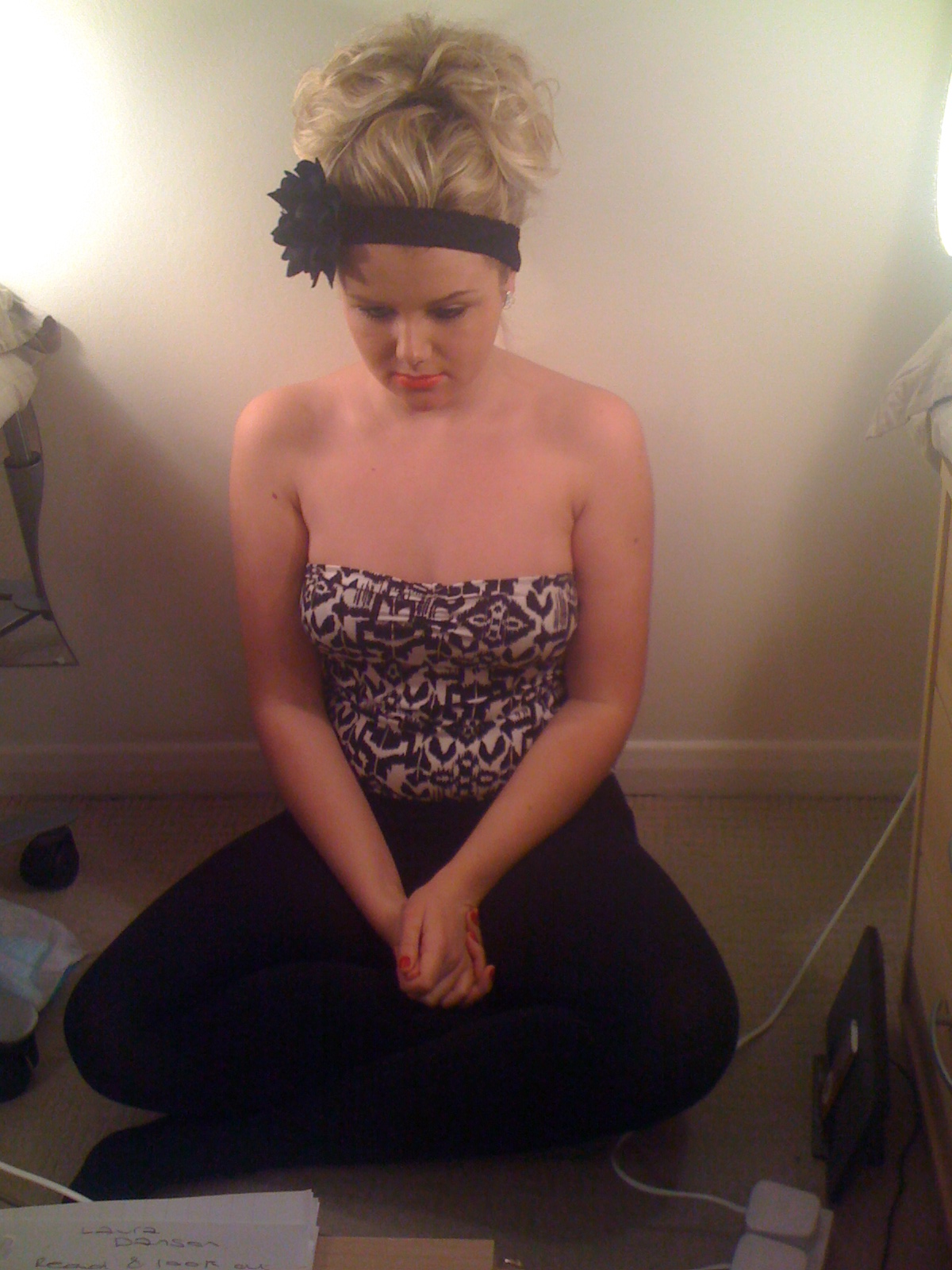
Liv with a full face of makeup on, hair up and looking in the mirror.

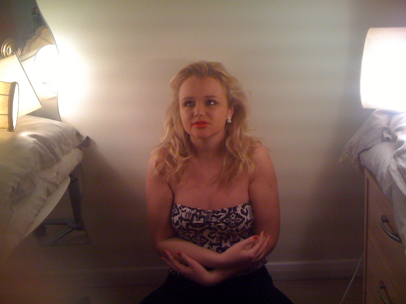
Liv with no makeup on singing to the song.

Liv taking her hair down and taking the headscalf, headband and flower off.

Liv singing to the song and beginning to cry.

Liv taking her makeup off and crying.

Liv singing.

Liv crying and wiping her makeup off with her hands. smudging lipstick etc.

Crying and singing to the song.

Crying and smudging makeup

Singing to the song

Crying taking her pearls off

Singing to the end of the song.
We cut from each of the shots by showing one shot of Liv with makeup on, and the next with no makeup on and singing. On the shots where Liv is wearing her makeup, she is seen taking her hair down and smudging her makeup and crying. We start the video with Liv wearing makeup, and we end it with her wearing none. The idea that shes taking her make up, whilst having bare shoulders and crying is suggesting she wants to reveal the real her. Hense the reason we end it on Liv singing, in her natural look. As she is expressing her feelings in the video it also relates to the underlying meaning of the song, that she is upset and fighting for a man.
Animoto isn't processing my photo's so i'll have to put them on here and keep trying. Liv drew out the 12 frames in order for us to follow it when we were filming.

Liv with a full face of makeup on, hair up and looking in the mirror.

Liv with no makeup on singing to the song.

Liv taking her hair down and taking the headscalf, headband and flower off.

Liv singing to the song and beginning to cry.

Liv taking her makeup off and crying.

Liv singing.

Liv crying and wiping her makeup off with her hands. smudging lipstick etc.

Crying and singing to the song.

Crying and smudging makeup

Singing to the song

Crying taking her pearls off

Singing to the end of the song.
We cut from each of the shots by showing one shot of Liv with makeup on, and the next with no makeup on and singing. On the shots where Liv is wearing her makeup, she is seen taking her hair down and smudging her makeup and crying. We start the video with Liv wearing makeup, and we end it with her wearing none. The idea that shes taking her make up, whilst having bare shoulders and crying is suggesting she wants to reveal the real her. Hense the reason we end it on Liv singing, in her natural look. As she is expressing her feelings in the video it also relates to the underlying meaning of the song, that she is upset and fighting for a man.
The New Idea and Evaluation


After looking at our first draft there are some elements which we think need improvement, after analysing the feedback we had we realised one or two things needed to be changed (especially the make-up) when we did the final piece.
Here is the feedback;
"I think the makeup is slightly over the top, and doesn't look realistic for the video"
"I like the makeup and think the more dramatic for a music video the better"
"I don't think you need to wear the black scarf around your head you could just with the headband and scarf"
"I like all of your accessories and think you should keep them all"
As you can see we received a varied response but after much discussion we have decided to use less makeup but still keep the makeup dramatic. After some research I found some images of women in a magazine and was inspired by their makeup, the pictures are above. I like the dramatic makeup the lady is wearing and the way she has done her hair, I like the red lipstick and the sleek eyes. Hopefully we can make our makeup more subtle but still have a dramatic look.
Subscribe to:
Posts (Atom)